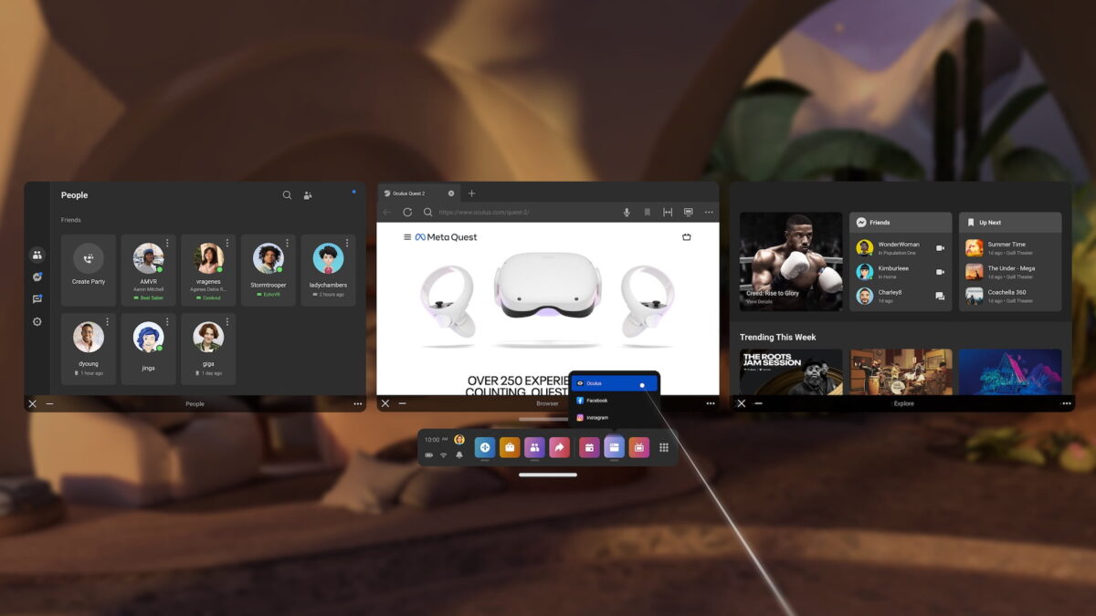
Meta is reworking some of Quest's core UI infrastructure to allow for better window management

Meta is making 'good progress' on a UI update for Quest, Meta's CTO said on Instagram.
Meta's CTO Andrew Bosworth was asked in his recent Instagram AMA if we should expect UX/UI updates that improve the management of 2D apps and windows. Bosworth responded:
"Yeah, absolutely. This is something that long before even AVP was on the scene we've been looking at and spending some time on, and we have some pretty exciting designs and really actually reworking some of the core UI infrastructure to be able to enable a richer environment, It has been in the works for a while and making good progress. So the answer is yes, I'll have a tight line for you. It's not super soon, but yeah, it's on the way."
Meta Quest's UI hasn't changed much in recent years and is in dire need of an overhaul. This is also true of the multitasking feature that Bosworth is talking about here.
Currently, three 2D apps can be opened and arranged as side-by-side windows on the same plane, but their position in space and in relation to each other is relatively fixed and difficult to adjust.
With the introduction of Vision Pro, this system looks outdated, since Apple's headset allows any number of windows to be freely placed in space (but visionOS currently lacks any kind of window management). Meta could follow this design to achieve feature parity with Vision Pro.
In terms of implementation, Meta will have to develop along the technical specifications of Quest 3, which lacks eye-tracking and possibly the processing power for more complex multitasking. The fact that improvements to Quest's user interface are coming is good news, but also long overdue.
Note: Links to online stores in articles can be so-called affiliate links. If you buy through this link, MIXED receives a commission from the provider. For you the price does not change.